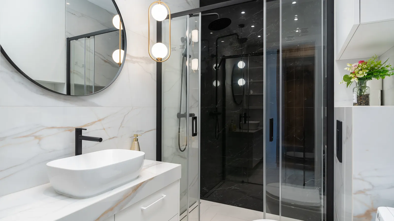
Bathroom lighting can make brown grout look dirtier than it is, make a cool gray read bluish, or make white grout look much harsher than expected. Before recoloring grout, separate the actual condition of the grout from the way its color interacts with the tile, daylight, shadows, and electric light.
The most useful approach is to test a few grout colors beside the existing tile in the bathroom, then inspect them in daylight and at night with the lights you normally use. A grout color that seems right under one light can be too warm, too cool, too dark, or too high-contrast under another.
Why clean grout can still look dirty
A deep cleaning can remove soil, soap residue, and surface staining without changing the visual relationship between grout and tile. If the grout is brown, tan, or warm gray beside tile with a pink, yellow, green, or cool-gray cast, that relationship may still read as muddy.
Several effects often overlap:
- Warm light can intensify warm grout. A brown or beige grout may look more yellow, orange, or reddish under warm bathroom lamps.
- Cool light can expose gray or green undertones. A gray grout that looked neutral in a store may appear blue, violet, or green in a cooler-lit room.
- Glossy tile creates highlights and shadows. Bright reflections on tile can make the adjacent matte grout lines appear darker by comparison.
- Small tile multiplies the effect. With mosaics or small-format wall tile, grout is a substantial part of the visible surface, not a minor border.
- Uneven illumination exaggerates variation. Shadows near a vanity, under wall cabinets, or on a shower floor can make consistent grout look blotchy.
- Moisture changes the appearance temporarily. Damp grout commonly looks darker than fully dry grout. Do not judge a color immediately after cleaning, showering, or mopping.
Lighting can affect how evenly grout appears as well as how light or dark it appears. Reflective and textured tile surfaces can amplify these perception effects, especially where overhead light creates directional shadows.
First, check whether it is a color problem or a condition problem
Do not use a grout pen or colorant to solve what may be remaining residue, moisture, or localized damage. Check the grout when it is dry and in ordinary room light.
Look for these clues:
| What you see | More likely explanation | What to do first |
|---|---|---|
| The whole floor or wall looks too brown, yellow, or dull | Grout color and tile undertones are clashing | Test alternate colors beside the tile |
| Certain sections look darker only after a shower or cleaning | Moisture is affecting appearance | Let the area dry fully before judging it |
| Dark patches follow splash zones, corners, or traffic paths | Remaining staining, wear, or moisture exposure | Clean and dry thoroughly; investigate persistent patches |
| Grout looks different under vanity lights than daylight | Lighting is shifting its apparent color | Test samples at multiple times of day |
| White colorant makes every tile outline stand out | Contrast is too strong for the tile size or pattern | Test a softer near-match, often a light gray or greige |
| A few joints remain distinctly darker in every condition | Local staining, failed sealer, repair work, or grout variation | Consider a targeted repair or professional assessment |
If grout is cracked, loose, powdery, or persistently dark in isolated wet areas, color testing is not the full solution. Address the underlying grout or moisture issue before applying a recoloring product.
Understand tile and grout undertones
The label "light gray" is not enough to predict the result. Both tile and grout can carry undertones that become more visible in a bathroom.
A white tile may be creamy, pinkish, blue-white, green-white, or gray-white. Brown grout may lean orange, red, yellow, olive, or charcoal. A light gray grout may lean cool blue, lavender, taupe, or beige. When two undertones disagree, the grout can look dirty even when it is clean.
Try this simple comparison:
- Hold a sheet of plain white printer paper next to the tile in daylight.
- Notice whether the tile now looks warm, cool, creamy, greenish, pinkish, or neutral.
- Place the same white paper beside the grout.
- Identify whether the grout appears orange-brown, red-brown, yellow-brown, olive-brown, cool gray, or taupe.
This will not give a perfect color name, but it helps reveal why a replacement color might fail. For example, a cool blue-white tile paired with yellow-brown grout can look aged or grimy. A warm cream tile paired with a blue-gray grout can look unexpectedly cold.
A practical test for grout color in a bathroom
Testing is more reliable than selecting a color from a small printed chart. Tile retailers and grout manufacturers commonly recommend viewing grout samples in the actual room because natural and artificial light can change the result. Merola Tile similarly recommends testing grout in the installation space before committing.
1. Choose three to five candidate colors
Start with a narrow group rather than every available option. For brown grout that feels dirty, useful comparison candidates may include:
- a light warm gray or greige
- a medium neutral gray
- a soft taupe that relates to the existing brown without matching it exactly
- an off-white or pale warm gray, if the tile is large and you want less visible grid pattern
- a deeper neutral gray, if you want deliberate definition and lower contrast than bright white
Avoid assuming that "white" is the cleanest-looking choice. On small tiles, white grout can turn every joint into a high-contrast outline and make the surface feel busier.
2. Make or obtain real samples
Use grout sample sticks, sample boards, or small cured grout samples where possible. If you are making your own test board, use spare tile or a similar tile piece and leave realistic grout joints between tiles.
Do not judge wet grout. Allow any sample to cure and dry according to its product instructions before comparing it with the bathroom surface.
3. Place samples in the most revealing locations
Set the samples against the existing tile rather than holding them in the center of the room. Check at least two locations:
- near the vanity or mirror, where face-level lighting is strongest
- on the floor, shower wall, or backsplash area that bothers you most
If the bathroom receives daylight, include a location near the window and one farther from it. Window direction can change the character of daylight through the day, so a color that looks neutral in morning light may look warmer or cooler later.
4. Observe at three different times
Check each sample in these conditions:
- Daylight only: Turn off electric lights when practical. This shows how the tile and grout behave in available natural light.
- Your usual morning or daytime lighting: Use the vanity, ceiling, and shower lights as you normally would.
- Nighttime lighting: This is often the most important test in a bathroom used before bed or early in the morning.
Take straightforward photos from the same position in each condition. Photos are useful records, but make the final decision with your eyes in the room. Camera white balance and automatic exposure can shift color substantially. For more context on this problem, see why 3000K lighting looks different in photos.
5. Compare contrast, not just the sample color
Step back several feet, then stand close to the tile. Ask different questions at each distance.
From across the room:
- Does the floor or wall look calm, busy, dark, or washed out?
- Are the grout lines the first thing you notice?
- Does the candidate make the room seem cleaner than the current grout?
Up close:
- Does the sample bring out an unwanted tile undertone?
- Does it make minor tile variation look intentional or chaotic?
- Does it look noticeably different between dry and slightly damp areas?
The goal is not necessarily to make grout disappear. It is to choose a level of contrast that looks intentional with your tile size, pattern, and bathroom lighting.
Choosing between light gray, white, and a softer neutral
For a homeowner replacing brown grout after cleaning, these are the usual visual tradeoffs.
Light gray
Light gray often reduces the starkness of white while looking cleaner and more contemporary than brown. But it must suit the tile undertone. A cool light gray can look blue against creamy tile; a warm gray or greige may work better with beige, ivory, or warm white tile.
White or bright white
White creates the strongest clean-versus-dirty impression initially, especially beside white tile. It also creates strong line contrast unless the tile is very close in color. On floors and shower areas, white can make future staining, mineral deposits, and uneven aging more obvious.
Warm gray, greige, or pale taupe
These can be useful middle positions when pure gray feels too cool and white is too sharp. They often preserve a little definition while avoiding the yellow-brown cast that made the original grout feel dirty. The risk is choosing a shade that repeats the same warm undertone you are trying to escape, so samples matter.
Medium gray or charcoal
A darker neutral creates a defined grid and can make tile shape or pattern more prominent. It may be a practical choice if you prefer visible joints, but it is not the best fix when the existing complaint is that dark lines dominate the room.
Check the lighting before changing the grout
If every candidate looks wrong at night, assess the bathroom lighting itself. A lamp's color temperature influences whether the room reads warmer or cooler, while color rendering affects how naturally subtle tile and grout colors are revealed. Learn the basics in What Is CRI in Lighting?.
You do not need to replace fixtures just to choose grout. However, a planned lighting update should happen before a major recoloring decision whenever possible. Test grout under the lighting you expect to live with, not only under temporary bulbs or a single mirror light.
If replacing lamps, use the same lamp type and color temperature in the lights that illuminate the tile most directly before making final comparisons. Mixed lighting can make one wall appear warm and another cool, even with identical tile and grout.
Common mistakes to avoid
- Choosing from a phone screen or online color chart. Screens cannot show the interaction with your tile, finish, and light.
- Testing against a loose tile somewhere else in the house. The bathroom's own lighting and surrounding finishes matter.
- Comparing wet grout with dry samples. Let both surfaces dry fully.
- Testing only under the vanity light. Include daytime and nighttime conditions.
- Using bright white to solve every problem. It can remove too much visual softness and create an overly outlined surface.
- Ignoring grout width and tile size. The same color has a larger visual effect with wide joints or small tile.
- Coloring damaged or damp grout without diagnosing it. Recoloring may conceal a problem temporarily without correcting it.
Make the final choice after a short lived-in test
Leave the sample board in place for several days if possible. Notice it during your normal routine: getting ready in the morning, using the room after dark, and seeing it in indirect daylight. The best candidate is usually the one that looks appropriately clean and deliberate in the widest range of conditions, not the one that looks brightest under one particular light.
If none of the samples works, do not force a grout-color decision. The issue may be an unsuitable lamp color, strong shadows, a tile undertone you had not noticed, or a grout condition problem rather than a simple color mismatch. A small test area, completed with the intended grout colorant or replacement grout, is a safer final check before treating the whole bathroom.
References
- How to Choose the Perfect Grout Color for Your Tile Project 鈥?Merola Tile. (n.d.). https://merolatile.com/how-to-choose-perfect-grout-color
- Grout Color Psychology: How Light vs. Dark Grout Changes Room Perception | East Hartford, CT | CarpetWorks. (n.d.). https://www.carpetworksllc.com/blog/articles/grout-color-psychology-how-light-vs-dark-grout-changes-room-perception
- Grout Color Secrets: Perfect Match Tips. (n.d.). https://www.tktile.com/post/how-to-choose-grout-color
- Grout Color Guide | Should You Match or Contrast Your Tile?. (n.d.). https://www.coylecarpet.com/blog/grout-color-guide-should-you-match-or-contrast-your-tile
- How to Choose the Right Grout Color for Your Tile. (n.d.). https://www.daltile.com/tile-therapy/articles/how-to-choose-the-right-grout-color-for-tile
- Why Grout Lines Look Uneven After Cleaning (And How to Fix It). (n.d.). https://www.itsallcleansandiego.com/why-grout-lines-look-uneven-after-cleaning-and-how-to-fix-it
- Grout Color Guide: How to Choose the Perfect Grout. (n.d.). https://cavastone.com/blog/grout-color-guide
- Why can grout look darker while it is still wet? Water temporarily .... (n.d.). https://www.facebook.com/100066520476306/videos/why-can-grout-look-darker-while-it-is-still-wetwater-temporarily-changes-how-lig/1071898452256295