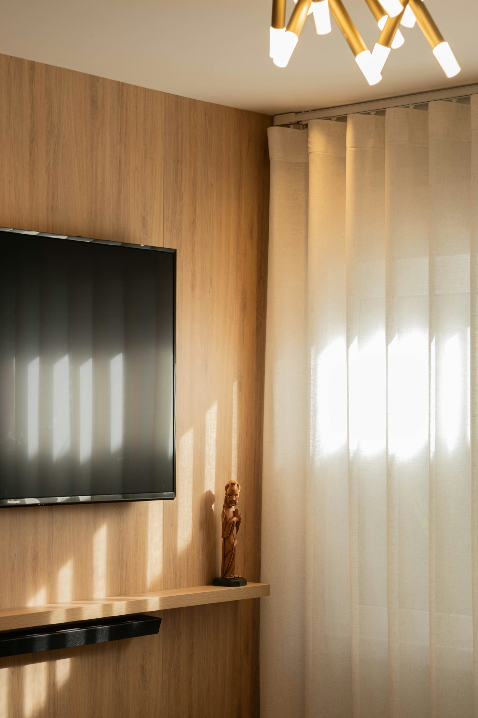
A room lit with 3000K lamps may look comfortable and balanced in person yet look orange, gray, blue, or patchy in a photo. That does not automatically mean the lamps are the wrong color temperature. The camera, its white-balance decision, daylight from windows, exposure settings, and the screen used to view the picture can all change the result.
The short answer to why 3000K lighting looks different in photos is that your eyes continuously adapt to the light around you, while a camera has to make a fixed interpretation of the scene. That interpretation is particularly unreliable when a bedroom combines warm LEDs with daylight.
What 3000K actually describes
A lamp marked 3000K has a warm-white correlated color temperature (CCT). It generally appears less yellow than traditional incandescent light, but warmer than 4000K or daylight-colored lamps. In a guest bedroom, 3000K is often chosen because it can make wood, textiles, and skin tones feel relaxed rather than stark.
CCT describes the apparent color of the light source. It does not guarantee that every photographed surface will look neutral, that walls will look the same on every camera, or that the room will match an edited listing photo.
It also does not describe color rendering. Two 3000K lamps can share a stated CCT but render paint, bedding, and wood somewhat differently. For more on that separate specification, see our guide to what CRI means in lighting.
Your eyes and the camera are doing different jobs
Human vision adjusts remarkably well to changing illumination. After a few moments in a room illuminated only by 3000K lamps, a white duvet or pale wall can still seem reasonably white. This is known as visual adaptation.
A camera sensor records the balance of red, green, and blue light reaching it. Its processing then applies white balance: a correction intended to make neutral objects appear neutral. When that correction is inaccurate, a room can acquire an interior photo color cast.
Auto white balance often estimates one overall correction for the whole image. As Cambridge in Colour explains, this can exaggerate differences between light sources in mixed indoor and natural lighting. A camera may therefore make one corner of a bedroom look excessively amber while making the window side look bluish.
Why 3000K can look orange in photos
Warm light looks orange in photos most often when the camera has not compensated enough for the warm LEDs. This can happen when:
- Auto white balance treats a colored wall, wood furniture, or beige bedding as the scene鈥檚 neutral reference.
- The photo includes a bright window, causing the camera to favor daylight instead of the warmer indoor light.
- A phone changes its white-balance decision from one frame to the next.
- The image is viewed on a display set to an unusually warm or vivid color mode.
- The photo was edited with a warm filter or an incorrect white-balance adjustment.
The reverse can happen too. If the camera strongly corrects for 3000K lighting, it adds a cooler correction. The room may then look sterile, blue, or unlike the warm room you intended to document.
Mixed daylight is usually the main problem
A bedroom with curtains open in daytime is not lit by 鈥?000K lighting鈥?alone. It may have daylight near the window, warm LED light near the ceiling or bedside, and reflected light bouncing from colored walls and furnishings. Each area can have a different color balance.
A single white-balance setting cannot make every part of a mixed-light scene perfectly neutral. If you set white balance for the warm bedside lamp, the daylight window area may look blue. If you set it for the window, the lamp-lit side may look orange. This is a limitation of the scene, not necessarily a defect in the installation.
For photographs intended to show the installed electric lighting, take a separate set after dark with window coverings closed. For photographs intended to show the room in daytime use, accept that some warm-versus-cool variation may remain unless you turn off one source or edit local areas separately.
Exposure can make the cast feel stronger
Exposure and white balance are different controls, but they influence how a color cast is perceived. Underexposed photos can make warm pools of light look dense and orange against dark walls. Overexposed windows can make adjacent parts of a room seem unusually cool by comparison.
Phone cameras also use computational processing to brighten shadows, preserve window detail, and boost contrast. Those adjustments can alter the apparent relationship between daylight and electric light. A photo that looks dramatic is not always a faithful lighting record.
A repeatable photo-check process
If you want representative photos before deciding whether to change your lamps, use a simple controlled comparison.
- Photograph the room at night first. Close blinds or curtains and switch on only the lights you want to assess. This shows how the 3000K installation behaves without daylight competing with it.
- Use a plain neutral reference. Place a white or neutral gray sheet of paper where the important light falls, such as on the bed or a desk. Avoid assuming that cream bedding, painted walls, or wood trim is neutral.
- Take one image on auto white balance. This is useful as a record of what a typical phone or camera decides, but not as final proof of the room鈥檚 color.
- Take another image with white balance set near 3000K. If your camera app allows Kelvin control, begin around the lamp鈥檚 stated CCT. A matched setting should make a genuinely neutral object look closer to neutral under that lamp, though the exact result can vary by camera and LED spectrum.
- Take a daylight comparison separately. In daytime, photograph the same viewpoint with the electric lights off, then with them on. The contrast will reveal whether the objection is actually mixed lighting.
- Compare on more than one screen. Disable unusually warm screen modes, night-shift settings, or strong 鈥渧ivid鈥?display modes when judging color. A phone display is not a dependable final reference when these features are active.
- Look at the actual room again. View it at the same time of day and with the same lights on. If the room is comfortable and the materials look right in person, an inaccurate camera rendering alone is not a strong reason to replace the lighting.
When to adjust the photo instead of the lighting
If the room looks good to occupants but only the photo looks wrong, start with the photograph. Choose a fixed white balance rather than auto, shoot in a format that permits later white-balance adjustment when possible, and correct the image based on a neutral object in the same light.
For a room that must show both a bright window and warm interior lighting, there may be no single global correction that looks fully natural. Editing software can sometimes correct different regions separately, but the underlying challenge is real: different areas were illuminated by different colors of light.
When the lighting itself may be the issue
A camera is not always to blame. Investigate the installation if the room also looks noticeably too yellow, pink, green, or inconsistent to people in person. Check whether fixtures use lamps with different stated CCTs, whether an older lamp has been left in place, or whether dimming changes the apparent warmth of certain sources.
Also compare the actual lamp labels. A nominal 3000K ceiling fixture, a 2700K bedside bulb, and daylight entering through a window can produce a more complicated result than a room with one consistent source. For a broader bedroom plan, see guest bedroom lighting ideas.
The useful conclusion
3000K is a warm lighting choice, not a promise that every photograph will look warm in the same way your eyes see it. In room photography, auto white balance may under-correct or over-correct the warm LEDs, and mixed daylight can make either result more obvious.
Before changing a lighting plan that works in person, photograph the room under controlled conditions: once at night with only electric light, once in daylight with electric lights off, and once with both sources present. Those three images make it much easier to distinguish a camera white-balance problem from a genuine lighting mismatch.
References
- Understanding White Balance. (n.d.). https://www.cambridgeincolour.com/tutorials/white-balance.htm
- This is how white balance works: Our eyes are insanely good .... (n.d.). https://www.instagram.com/reel/DULs1CfgiZ3
- User-guided White Balance for Mixed Lighting Conditions. (n.d.). https://www.cs.cornell.edu/projects/white_balance/download/mixed_lighting_white_balance_hires.pdf
- Auto White-Balance Correction for Mixed-Illuminant Scenes. (n.d.). https://www.youtube.com/watch?v=bhMdH0ZY51s
- White Balance and The Colour of Light - Photography Courses. (n.d.). https://exposuretherapy.ca/photography-guide/white-balance-and-colour-of-light
- White balance setting when shooting with mixed lighting/colored lights? : r/cinematography. (n.d.). https://www.reddit.com/r/cinematography/comments/15w4dja/white_balance_setting_when_shooting_with_mixed
- White Balance Explained: How To Get Accurate Colors In Your Photos. (n.d.). https://photographypro.com/white-balance
- Instagram. (n.d.). https://www.instagram.com/reel/DXFAPmBEg5b?hl=en


